Pixexo
The Strategic Pixel

Editorial, Czech Precision

We don't build websites. We architect digital experiences that convert ambiguity into clarity.

Every pixel has a purpose. Our process begins with a strategic audit, not a mood board. We map the user's mental model against your business goals, then design the structure. This eliminates the 11th-hour surprises that plague typical web projects, delivering a system built for conversion and scale.

"Prague's historic architecture informs our structural thinking—every element has a load-bearing purpose. We design for resilience, not just release."

— Pixexo Manifesto
Studio Philosophy Nám. Republiky 1, Prague

Process is Protocol.

A predictable journey eliminates risk. Our workflow is a tested sequence of checkpoints designed to surface decisions early and keep scope locked.

Phase 1

Discovery & Strategic Mapping

We conduct a technical and UX audit of your current state. This isn't about colors; it's about mapping user friction points and business goal alignment. The output is a single, shared document.

Phase 2

Wireframe & Structural Prototyping

We build the skeleton. This is where information architecture and conversion paths are defined, tested, and iterated before any visual design begins. It's the most critical phase.

Phase 3

Design & Component Library

We create a visual system, not just pages. Every element is a reusable component with defined states, ensuring consistency and speeding up future development.

Phase 4

Development & Rigorous QA

Semantic code, performance budgets, and a 48-hour pre-launch testing period. We do not ship with known defects.

Process Glimpse: User Flow Sketch
Pitfall Rail

Common Mistake: "Design by Committee" where every stakeholder adds a change, creating a disjointed experience. Our protocol provides one clear, expert direction based on the strategic map.

Case Study E-commerce / Checkout Optimization

The Artisan Coffee Roaster: Rebuilding Trust at Checkout

The Challenge: A beloved local roaster with a beautiful product but a confusing, outdated e-commerce site. Data showed a 40% cart abandonment rate at the final step, primarily due to unclear shipping information and a lack of trust signals.

The Insight: Users wanted to know the exact cost and timing before committing. The original multi-page checkout added friction and anxiety.

The Solution: We designed a single-page checkout experience. It featured embedded trust badges, a real-time shipping calculator tied directly to the cart total, and a minimalist form layout that reduced cognitive load.

"Pixexo didn't just redesign our site; they diagnosed our business problem. The new checkout feels less like a transaction and more like a conversation."

— Anna K., Founder

Measurable Outcome

12%
Cart Abandonment
+22%
Avg. Order Value

Tool Stack

  • Figma3.0
  • React18.2
  • Next.js14.1
  • StripeAPI v3
See More Work

The Pixexo Standard: Deliverables & Boundaries

A clear specification of what you receive and what is excluded, ensuring scope alignment from day one.

Core Build

Fully responsive website built on a modern, maintainable framework (Laravel or static site generator).

Design System

Custom icon set and typography system, licensed for perpetual use.

Performance

Targeting a Google PageSpeed score of 95+ on mobile at launch.

SEO Foundation

Semantic markup, meta tags, and XML sitemap configuration.

Post-Launch Support

30 days of support for minor adjustments and bug fixes.

Exclusions

Ongoing hosting, content updates, and third-party plugin management are not included unless specified in a separate retainer agreement.

Decision Lens: Code vs. No-Code

We Choose Custom Code When:

  • Long-term scalability is critical.
  • Third-party API integration is complex.
  • Performance budget is strict.

Trade-off: Higher initial cost, longer timeline.

We Recommend No-Code When:

  • Content needs frequent, simple updates by non-technical staff.
  • Timeline is aggressive (under 4 weeks).
  • Functionality is standard (blog, basic e-commerce).

Trade-off: Limited customization, platform dependency.

Chapter 1

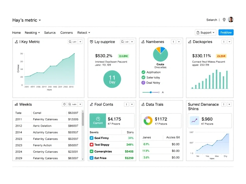
The Brief: A SaaS Dashboard in Crisis

Client: A mid-size B2B SaaS company with a flagship analytics dashboard. The problem wasn't aesthetics; it was function. User support tickets indicated that key metrics were being misinterpreted, leading to poor business decisions. The initial brief was "make it look modern."

Our first act was to reject the visual brief and replace it with a data audit. We spent the first week embedded with their customer support team, categorizing every ticket related to confusion. We mapped the top 5 points of cognitive friction.

// Extract from original client brief
Requirement: "Redesign dashboard. Must feel modern."

Chapter 2

The Pivot: From UI Refresh to Information Architecture Overhaul

We discovered the core issue: the data hierarchy was inverted. The most critical metric (Monthly Recurring Revenue) was buried in a secondary tab, while less important engagement metrics dominated the main view. A visual refresh would have masked the problem, not solved it.

Our pivot involved pushing back on the client. We presented a wireframe that moved MRR to the top-left, the industry standard "prime real estate." It included a new "Metric Confidence" indicator—color-coded icons showing data freshness and calculation methodology. This was a risky addition; it added visual complexity.

Dashboard Wireframe Pivot
Chapter 3

The Launch & Outcome

The new architecture launched after a 6-week development cycle. The "Metric Confidence" system, initially a point of debate, became the most praised feature. It directly addressed the root cause of misinterpretation.

What We Feared

That the added "confidence" icons would clutter the UI and lower performance.

What We Learned

Clarity trumps minimalism. Users valued knowing *why* a number might be provisional.

"Support tickets related to data confusion dropped by 62% in the first month. Our account managers now spend less time explaining and more time strategizing."

— CTO, Client Dashboard Co.

Tool Stack

Figma 3.0 React 18.2 TypeScript 5.0 D3.js (charts) Jest (testing)

Your Strategic Audit Awaits.

We begin with a 90-minute strategic audit. We'll review your current state, your goals, and your constraints. The output is a single document: our shared map for the project.

Pixexo Studio

Nám. Republiky 1
110 00 Praha 1, Czechia

+420 734 441 990 | [email protected]

Mon-Fri: 9:00-18:00 CET